Drive Monitoring & Control Module

Drive Monitoring & Control Module

Drive Monitoring & Control Module

Drive Monitoring & Control Module

Redesigning the 20-HIM-A6 to give technicians and engineers a clearer, faster, and more intuitive way to control variable frequency drives.

Redesigning the 20-HIM-A6 to give technicians and engineers a clearer, faster, and more intuitive way to control variable frequency drives.

Redesigning the 20-HIM-A6 to give technicians and engineers a clearer, faster, and more intuitive way to control variable frequency drives.

Redesigning the 20-HIM-A6 to give technicians and engineers a clearer, faster, and more intuitive way to control variable frequency drives.

Role

UX Designer

Timeline

2021–2022

Tools

Adobe XD → Axure → Figma

Platform

Industrial HMI Device

Challenge

The 20-HIM-A6 Human Interface Module had been in the field since 2010. Over a decade, the interface accumulated complexity without clear structure, controls were buried, features were hidden, and technicians had to fight the UI to do basic tasks. By 2021, user confusion and reduced operational efficiency made modernization critical.

The 20-HIM-A6 Human Interface Module had been in the field since 2010. Over a decade, the interface accumulated complexity without clear structure, controls were buried, features were hidden, and technicians had to fight the UI to do basic tasks. By 2021, user confusion and reduced operational efficiency made modernization critical.

Approach

We started with research at scale: 52 global interviews using the KJ method to surface and prioritize recurring pain points. We followed up with a Comparative Usability Evaluation with 12 participants, benchmarking our product against competitors. An open card sorting exercise revealed how technicians actually think about grouping controls.

We started with research at scale: 52 global interviews using the KJ method to surface and prioritize recurring pain points. We followed up with a Comparative Usability Evaluation with 12 participants, benchmarking our product against competitors. An open card sorting exercise revealed how technicians actually think about grouping controls.

The interface wasn’t just outdated, it actively hid the features technicians needed most. The real problem was structure, not style.

The interface wasn’t just outdated, it actively hid the features technicians needed most. The real problem was structure, not style.

The interface wasn’t just outdated, it actively hid the features technicians needed most. The real problem was structure, not style.

The interface wasn’t just outdated, it actively hid the features technicians needed most. The real problem was structure, not style.

Key Design Decisions

Key Design Decisions

Key Design Decisions

Intuitive Navigation

Reorganized all controls based on card sorting results to match technicians’ mental models.

Clear Status Indicators

Redesigned the display to surface critical parameters: drive name, RPM, current, and frequency, immediately on the home screen.

Responsive Interactions

Streamlined common workflows so routine tasks required fewer steps and less cognitive load.

Surface Hidden Features

Functions buried in sub-menus were elevated to primary navigation based on research findings.

Solution Walkthrough

Solution Walkthrough

Solution Walkthrough

Step 1

Understanding the Scope

Understanding the Scope

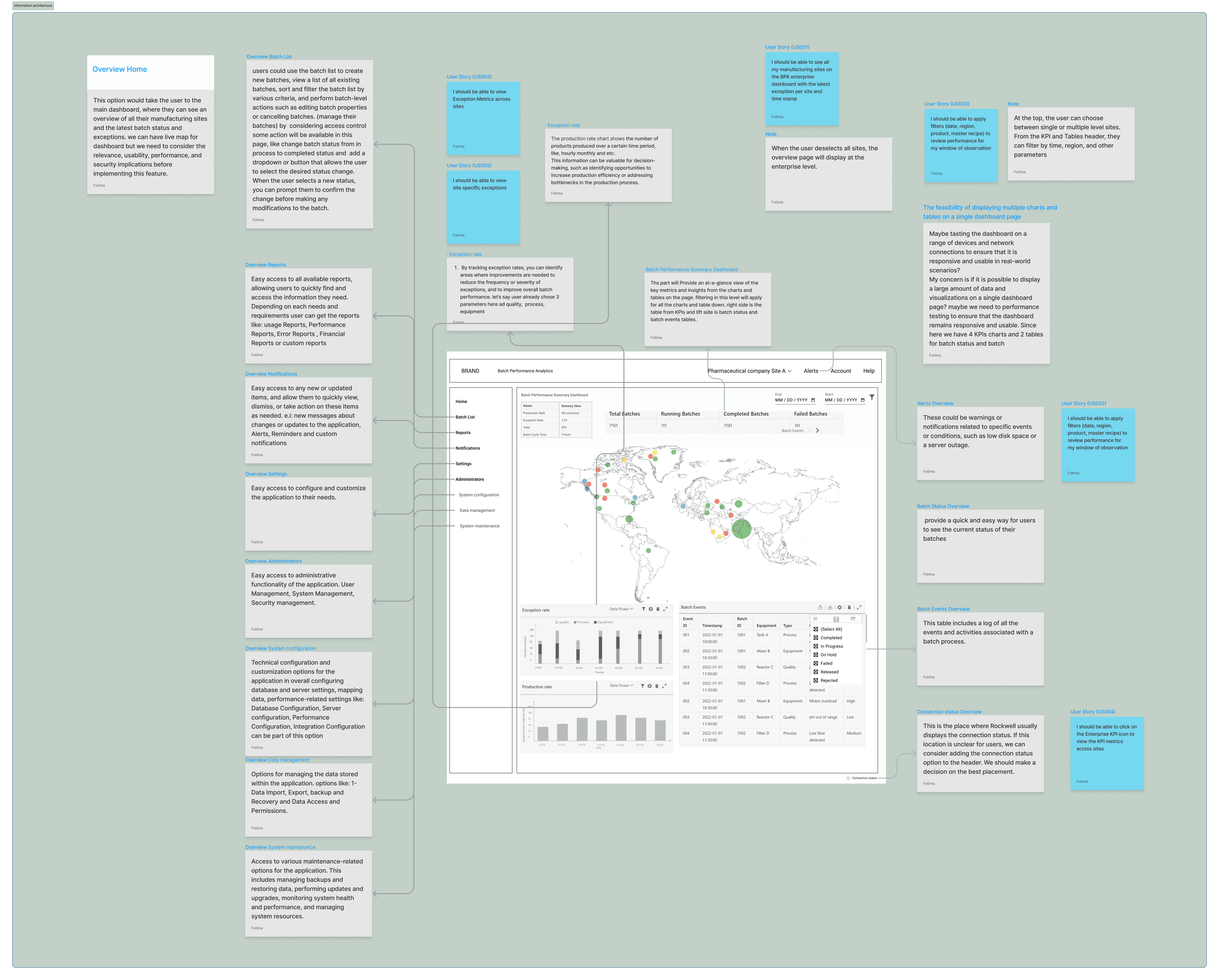
52 global interviews, KJ method to cluster findings.
Step 2

Competitive Benchmark

Competitive Benchmark

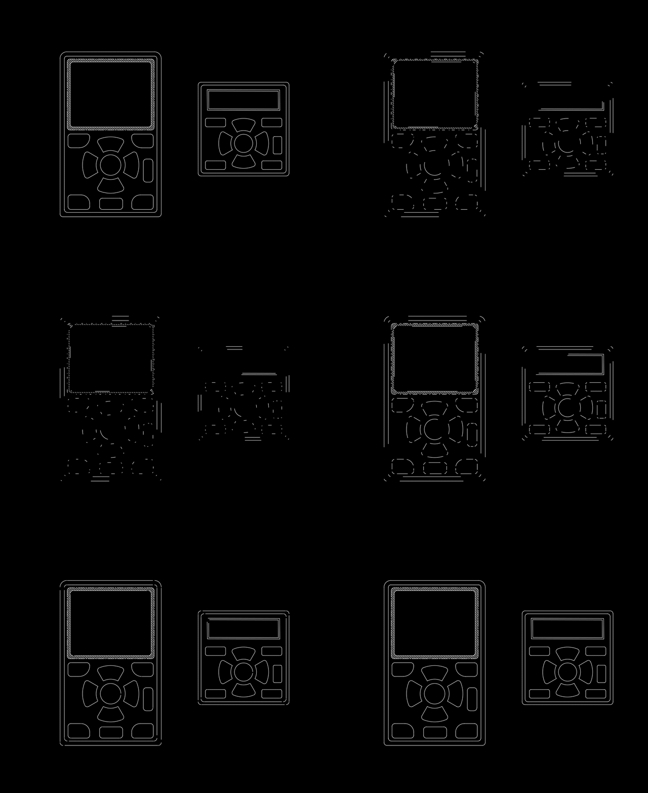
Usability Evaluation with 12 participants.
Step 3

Card Sorting

Card Sorting

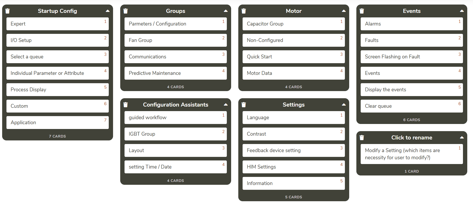
Open card sorting exercise Feb 2022 to validate IA.
Step 4

Data Analysis

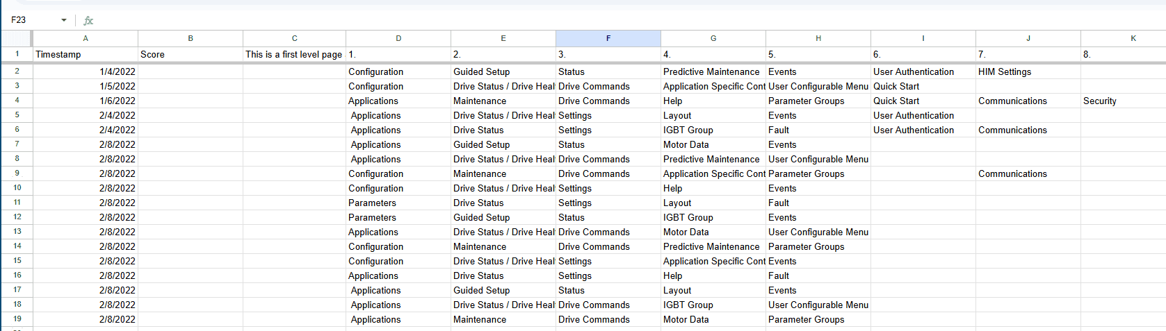
Data Analysis

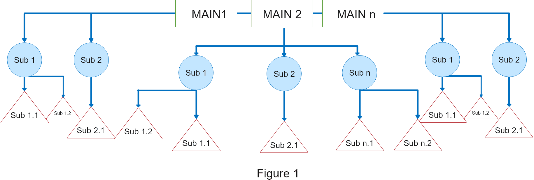
Visualized interview and workshop data in Excel.
Step 5

Redesigned Interface

Redesigned Interface

Final HIM design with intuitive nav, clear status display, responsive controls.
Impact

Impact

Impact

Transformed a 10-year-old interface into an intuitive, user-friendly system

Transformed a 10-year-old interface into an intuitive, user-friendly system

52 global interviews + 12-participant usability study

52 global interviews + 12-participant usability study

IA validated through open card sorting

IA validated through open card sorting

Consistent design delivered across 3 tools

Consistent design delivered across 3 tools

Key Takeaways

Key Takeaways

Key Takeaways

Flexibility is Key to Success

Flexibility is Key to Success

Seamlessly transitioned between Adobe XD, Axure, and Figma, maintaining design consistency without delays.

Impact Happens Outside Your Lane

Impact Happens Outside Your Lane

Stepping outside UX to support CAD modeling showed that proactively asking “How can I help?” leads to stronger outcomes.