

Corresi
A B2B case intake and account-manager platform that helps law firms triage incoming legal cases, track urgency, and decide fast before the response window closes.
Challenge
Law firms don't need more leads — they need to know which ones are worth pursuing. Account managers were juggling inbound case requests with no shared way to gauge urgency or status, and attorneys still bottlenecked on sign-off while paralegals carried the daily caseload.
Approach
Triage wasn't a follow-up step — it was the product. Our team spent spring quarter on interviews and a competitive analysis of four legal-tech tools, then used those findings to design and test a B2B account-manager experience where urgency, status, and case details surface immediately.
CLIENT
Corresi
PROGRAM
UCI HCID — 4-Person Team
TIMELINE
Spring–Summer 2026
ROLE
Product Designer, Team of 4
KEY INSIGHT
Attorneys and account managers didn't want a tool to decide for them — they wanted one that helped them decide faster. The real gap wasn't lead volume; it was a fast, trustworthy way to triage the cases already coming in.
Competitive analysis
SimplyConvert
Up to 400% more client engagement via AI-powered intake — but the experience feels transactional.
Lawmatics
Some firms save 10 hrs per team member weekly on follow-up — volume over relevance.
EvenUp
AI-drafted demands are 69% more likely to reach policy-limit settlements — invisible to the client.
CasePacer
Faster case cycle time via real-time document collection — a task list, not a relationship.
What we heard from law firm staff
“
"I don't even know how to file anything, to be honest."
— Associate Attorney
“
"You have to be kind of like pestering [attorneys], holding their hand."
— Paralegal
“
"There were three or four million documents we needed to look through."
— Law Clerk
Key questions
01. What's actually broken in how firms handle inbound cases day to day?
Attorneys hold sign-off authority; paralegals carry most day-to-day work across 3–4 single-purpose AI tools with no shared view.
02. What are today's legal-tech competitors missing?
Four leading tools — SimplyConvert, Lawmatics, EvenUp, and CasePacer — help firms move faster; none help clients feel cared for.
03. What do legal professionals actually want from a new tool?
A tool that fits around what they already use and supports their judgment, not replaces it.
Key takeaways
1. Volume outpaces bandwidth
Firms can't manually screen every inbound inquiry.
2. Eligibility is the real bottleneck
Most delays come from confirming a case actually qualifies.
3. Firms trust their own judgment
A tool needs to support decisions, not replace them.
4. Fragmented tools slow everyone down
Intake, tracking, and filing live in different places.
Why we prioritized this direction
Our Spring research surfaced four possible B2B features, scored on impact versus effort. We prioritized the one closest to Corresi's existing pipeline and our client's immediate need — the rest are sequenced for later.
✓ Submit-A-Case
Highest benefit for the effort — the AI-guided intake and firm-matching pipeline this case study covers.
✓ Continuous Client Communication
High potential impact, but needed firm-side infrastructure we hadn't built yet — sequenced next.
✓ Semantic Document Search
Valuable for large firms, but a narrower audience than our core B2B need.
✓ Post-Settlement Communication
Lower effort, but only matters after a case closes — sequenced last.
Requirements
User story
As an account manager, I need inbound cases sorted by urgency and fit, so I can respond before the window closes.
As a firm partner, I need visibility into the full pipeline at a glance, so I can see where cases are stalling before it's too late.
Problem statement
Sarah needs a fast way to tell which inbound cases are worth pursuing, because reviewing each one manually means high-value cases sometimes wait the longest.
Firm leadership needs a real-time view of the pipeline, because case status lives across spreadsheets and inboxes rather than one shared source of truth.
MVP priority list
Surface the cases with the tightest response windows first.
2. Centralize case status
One shared view instead of scattered spreadsheets and email.
3. Track conversion end to end
From first inquiry to won case, so firms see what's working.
Design & prototyping
Before the dashboard shown in this case study took shape, we mapped the full intake-to-decision logic in Figma and prototyped it end to end. Below is the actual case-routing flow we designed — how a case moves from submission, through an eligibility check, into matching firms' inboxes, and on to a decision.
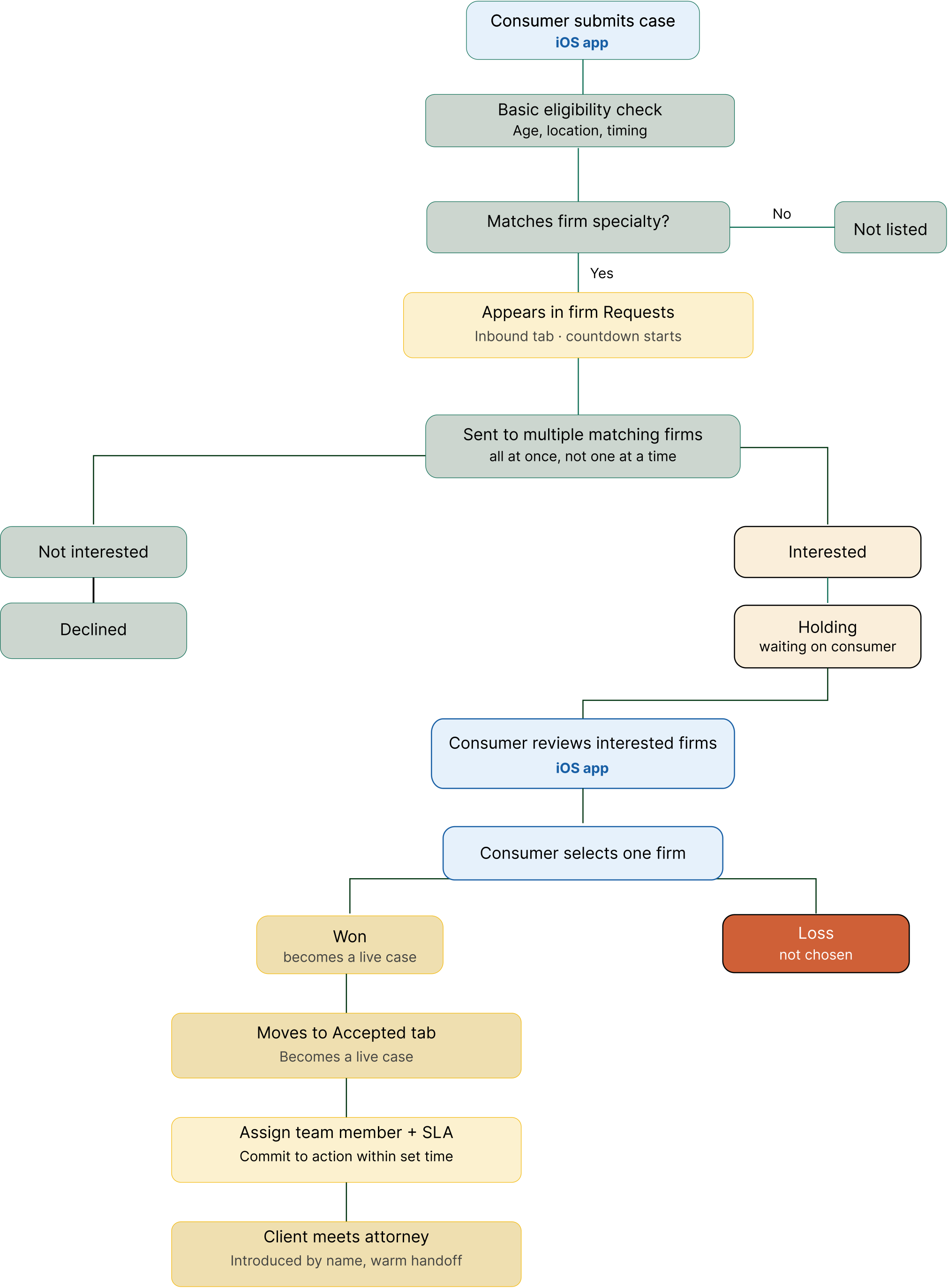
Case-routing logic — Figma flow diagram

One of the first screens we sketched: a plain confirmation state after a client submits a case, before we had designed any of the firm-facing side. It's rough — but it's where the "submit once, hear back from interested firms" idea started.
Two ways to ask for the story
Early on, we sketched two different ways a client could describe their case — a structured form, and a conversational, chat-style intake — to explore what individual case submission could feel like. These were illustrative concepts, not something we formally usability-tested; we later simplified that flow to a single confirmation screen once a case is submitted. The usability testing and validation in this case study was on the firm side, shown next: the account-manager dashboard.
The tested product
This is the firm-side account-manager dashboard — the actual clickable prototype we ran through a 25-session usability benchmark and moderated walkthroughs with account managers.
Dashboard — pipeline health at a glance
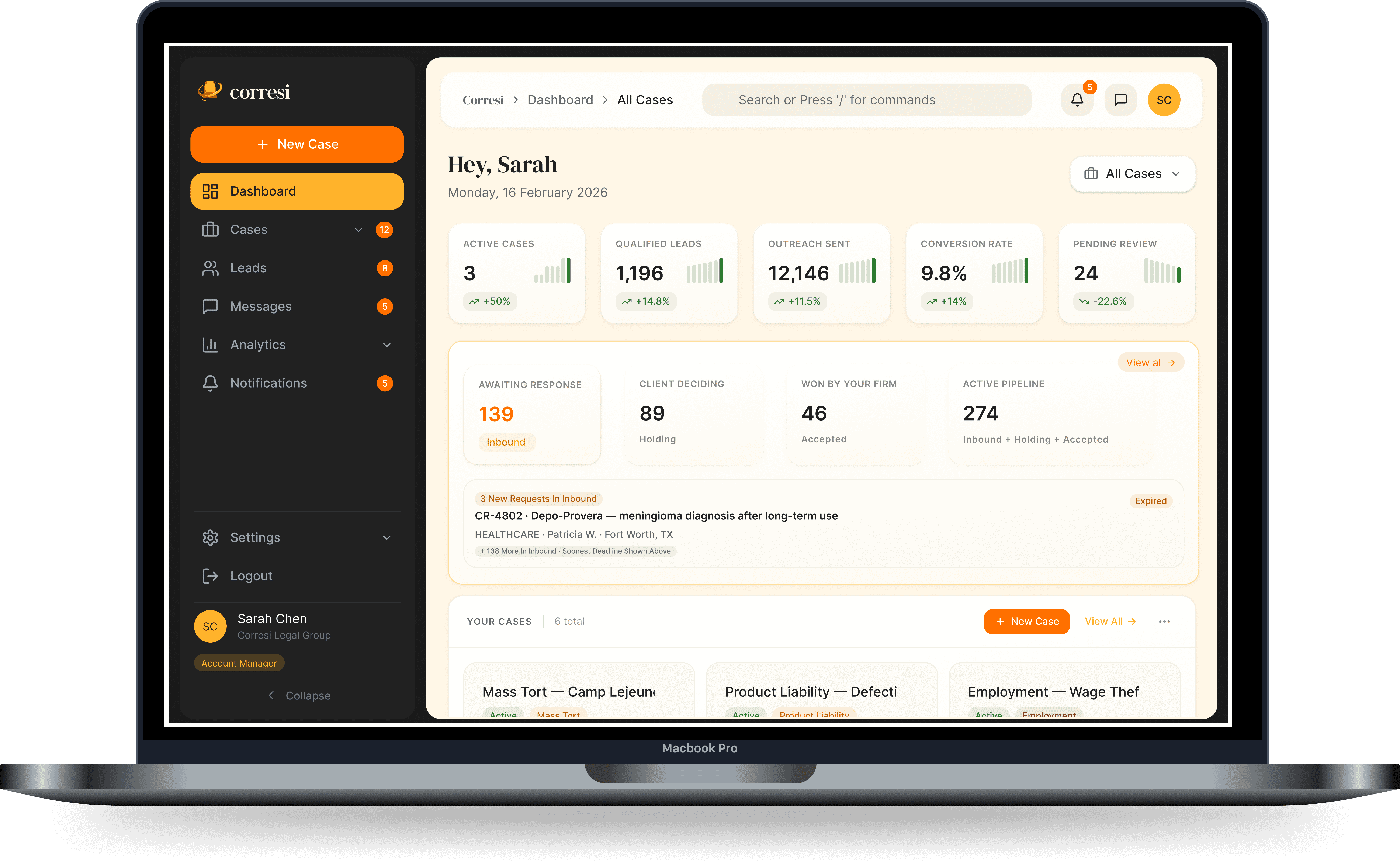
Requests / Inbound — the triage queue

Key design decisions
Urgency-First Triage
We sorted the inbound queue by response-window urgency, not arrival order, so cases at risk of expiring surface first.
At-a-Glance Metrics
The five headline stats sit above the fold so an account manager can gauge pipeline health in seconds.
Transparent State Changes
Usability testing found 'Loss' was our most ambiguous status label. Every action now opens a confirmation that spells out what happens next, so a status change never feels like a black box.
Before / After
From email threads and spreadsheets to one shared dashboard
BEFORE — Case requests arrived by email and were tracked by hand.
AFTER — Corresi centralizes intake, triage, and response in one dashboard.
1. Request received
A new case request arrives by email, with no shared view of urgency or status.
1. Case submitted
A case request enters Corresi through structured, AI-guided intake.
2. Logged by hand
An account manager manually logs the request details into a spreadsheet.
2. Triaged by urgency
Inbound requests are sorted by response-window urgency, not arrival order, so cases at risk of expiring surface first.
3. Urgency assessed ad hoc
Response-window urgency is judged case by case, with no consistent triage order.
3. Reviewed on the dashboard
Account managers see pipeline health at a glance — active cases, qualified leads, outreach sent, and conversion rate.
4. Waits on attorney sign-off
The request sits until an attorney is available to review it, often the workflow's biggest bottleneck.
4. Confirm interest or decline
A confirmation step spells out exactly what happens next before a firm commits.
5. Response sometimes misses deadline
Without a shared countdown, some requests pass their response window before a decision is made.
5. Status stays visible
Cases in Holding show how many other firms are competing and how long the client has been deciding.
Validated by testing
80%
rated core tasks Easy or Very Easy
64%
likely to adopt Corresi for their firm
0%
directness — every navigation task needed a backtrack
7/25
cited dashboard density as the top pain point
Lessons & takeaways
Designing for legal workflows meant designing for trust as much as speed: attorneys don't want a tool to decide for them — they want one that helps them decide faster. Usability testing proved that concretely — testers understood 'Declined' and 'Expired' just fine, but 5 of 25 couldn't say what 'Loss' meant, which told us status language needs testing, not assumption. If we started over, we'd validate that vocabulary — and the triage logic itself — with account managers before locking either one in.